
Two realities are transforming the way we live and showcase our interiors: the quality of the air we breathe at home, and the appearance of our rooms through a screen. These two aspects, although linked by common material choices, deserve to be considered together.
Healthy materials and indoor air quality: an underestimated selection criterion
Choosing a color or finish for your living room without checking its composition is like selecting food solely based on its packaging. The demand for VOC-free paints and formaldehyde-free panels has significantly increased in the French market in recent years, driven by a growing awareness of indoor pollution.
Further reading : How to Boost Your Career with Innovative Professional Support Solutions
Several actions can guide a decor towards a more breathable interior:
- Favor paints with a European eco-label or the A+ mention on the health label, which guarantees a very low level of volatile pollutant emissions after application.
- Opt for upholstery fabrics (cushions, curtains, sofa coverings) that are chemically untreated, made from raw linen, organic cotton, or unbleached wool, rather than synthetic textiles with stain-resistant finishes.
- Check the composition of reconstituted wood furniture (bookshelves, coffee tables, consoles): the adhesives used in particle boards remain the primary source of formaldehyde in a living space.
This approach does not limit aesthetic possibilities. A lime-coated wall offers a matte and lively texture that no acrylic paint can replicate. A terracotta or natural stone floor ages better than laminate, while being inert in terms of emissions.
See also : How to connect to ColiShip business and optimize your Colissimo shipments
Those who wish to explore decor with Direct Maison will find ideas to combine aesthetics with more thoughtful material choices, without limiting themselves to a catalog of labeled styles.
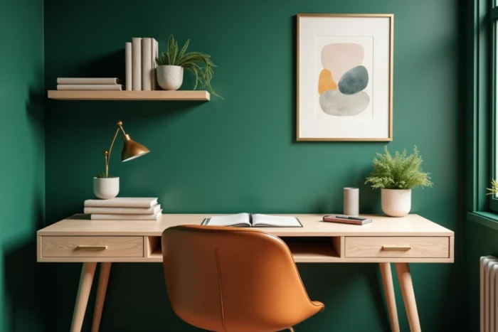
Decorating for the screen: the wall behind the desk changes everything
The interior is also designed with its appearance on camera in mind. Professional video conferences, social media content, daily video calls – the wall behind a desk or sofa has become a real decoration topic.
An overly busy background tires the viewer’s eye. A completely bare wall gives a cold or impersonal impression. The balance point lies in a sober yet textured treatment: a muted shade (sage green, light terracotta, warm gray), one or two well-spaced frames, and a spot light source that avoids harsh shadows on the face.
Light and color under the webcam test
Saturated colors pose a specific problem on screen: they “bleed” on common video codecs and create an artificial halo around the silhouette. In contrast, desaturated tones and matte materials perform well in video compression. A wall painted in satin will reflect the ceiling light and create a distracting white spot, while a matte finish will absorb excess brightness.
Placing a task lamp at face height, facing the desk, further improves the video appearance more than any wall decor choice. This is a design detail that should be integrated from the outset of the workspace design.
Reuse and second-hand: a decor trend that goes beyond aesthetics
Recovering an antique piece of furniture or hunting for an item at a flea market is not just a militant gesture. From an air quality perspective, an old solid wood piece has finished emitting volatile compounds for decades. It is, therefore, healthier than a new piece made from freshly manufactured particle board.
Reuse raises a real question of visual coherence. Mixing eras works as long as a common thread is respected: the material (all wood, all metal), the color palette, or the size of the pieces. A 1960s armchair can coexist very well with a contemporary coffee table if both share clean lines and a similar wood tone.
What reuse does not solve
A vintage sofa with sagging upholstery may sometimes cost more to restore than to replace. Similarly, old upholstery fabrics may contain fire retardants that are now banned. Checking the structural condition and textile composition before purchase remains a precaution often overlooked in the excitement of the find.
Patterns and colors: think by room rather than by annual trend
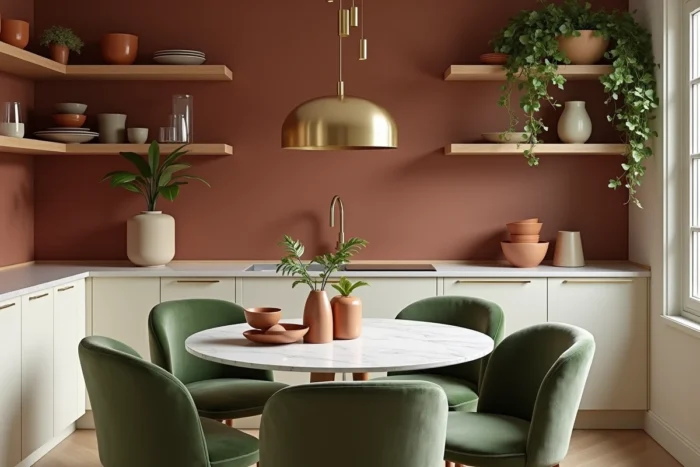
Applying a “color of the year” in every space of a home produces a monotonous result. Each room has its own natural light, function, and time of occupancy. A deep green that enhances a south-facing living room will appear dull in a windowless entryway.
The most reliable logic is to start from the available light in each space. Dimly lit rooms benefit from light and warm shades (off-white, rosy beige). Very bright rooms can handle bolder colors without becoming oppressive.
Patterns work better in small targeted doses: cushions, a single wall of wallpaper, a rug. Covering an entire living room with geometric patterns creates a visual saturation that is hard to endure daily, even if the result looks good in photos.
A space where one can breathe well, that looks good on video calls, and incorporates carefully chosen second-hand pieces remains relevant well beyond a season. A choice of verified materials, lighting adapted to digital uses, and a few thrifted furniture pieces whose structural condition has been checked form a more solid foundation than any seasonal palette.